Two Pictures from Different Ages – Compare and Contrast!

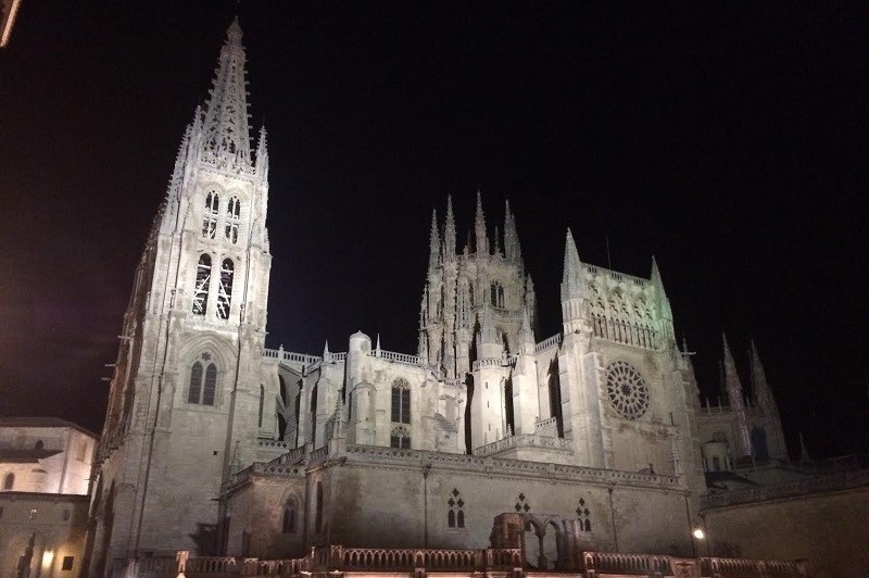
I was recently in Burgos, Spain and saw the splendid cathedral there. My first view of it came at night and I took the photo above. What a magnificent building; such proportion and symmetry! It reminds me of tall trees in a forest, majestically reaching up to the heavens. The flying buttresses supporting the soaring walls and towers showcase a great advance in building technique.

These were the skyscrapers of the Middle Ages. Such angular, geometric, and vertical beauty; almost like a forest, a fair flower of the 13th century echoing God’s creation and pointing to Him in a great work of human praise.

Two medieval phrases come to mind in the beauty of this building:

      • Beauty is id quod visum placet – Beauty is that which pleases when seen.
      • Pulchra dicuntur quae visa placent – Things that give pleasure when seen are called beautiful.

A mere thirty yards from this beautiful cathedral in the town square is something that is not beautiful in any traditional sense. I took the photo of it that is on the left. It was not uplifting and seemed to correspond to nothing in creation (unless one were to imagine a dinosaur dropping or a huge stumbling block). Like most modern abstract art, it looks more to me like someone’s nightmare. It seems to have little to say other than “Try to figure me out, you ignoramus.” Indeed, that is what I am usually called by art critics when I express dismay at these sorts of ugly blobs that clutter too many of our public squares and “art” museums.

Some disparagingly refer to the Middle Ages as the “dark ages” while referring to the current age as “enlightened.” Certainly, no age is perfect, but compare and contrast the two items in the photos here: uplifting, soaring, and inspiring; the other is dark and brooding, and its meaning is opaque. One is an uplifting building from the 13th century, the other a dark “who knows what” from the 20th century. Based on representational art, which age seems more inspiring? Which seems more enlightened? Decide for yourself, but I’ll take the 13th century!

Generally speaking, the idea at work in modern art is that it is merely the expression of the artist. We who view it are supposed to respect the artist expressing himself. This is largely a outgrowth of the subjectivism that fills our time.

The ancient idea however was that art is recta ratio factibilium (right reason in regard to things that are made). So the ancient ideal in things to be made, including art that the focus is not me, is not the artist, it is whether the art reflects conformity to the way a reasonable person can perceive the world. This does not mean that every painting must be like a photograph, or that sculpture should be an exact replica of what is. But it does mean that it has some conformity with reality that a reasonable person can perceive. So much modern art (not all) is either meaningless, or has no set meaning, it does not appeal to our reason or speak to our communal understanding of the reality about us.

Hence, St. Thomas Aquinas (also from the 13th century) spoke of beauty as consisting of integritas, consonantia, and claritas.  He writes,

For beauty includes three conditions: “integrity” or “perfection,” since those things which are impaired are by the very fact ugly; due “proportion” or “harmony”; and lastly, “brightness” or “clarity,” whence things are called beautiful which have a bright color [Summa Theologica I, 38, art 8].

In applying these criteria to art and architecture, we might consider the following:

Integritas (Integrity) – This speaks to the manner in which something echoes the beauty of what God has done. Thomas says that every created being is beautiful because God gives beauty to all created beings by a certain participation in the divine beauty. Therefore, human art and architecture are said to have integrity insofar as they participate in and point to the divine beauty of things. This need not mean an exact mimicry, but it does require at least a respectful glance to creation, holding forth some aspect of it so as to edify us with better and higher things. The cathedral pictured above points to a majestic forest as its form, its soaring stone to the mountains. Its colored glass allows the natural light to dazzle the eye and tell the stories of the Gospels. It is a sermon in glass and stone. As such, it has integrity, because it puts forth God’s glory. I’m not sure what the dark metal blob says. To what does it point? I have no idea. Because it is not integrated into the glory of creation (in any way that I can discern, at least) it does not have integrity. Rather, it seems to mock creation. If you think it is beautiful and has integrity, I invite you to explain why and how; I am at a loss to see any meaning at all in it.

Consonantia (Proportion) – This refers to the order and unity within a given thing. What God creates has a unity and purpose in its parts, which work together in an orderly fashion to direct something to its proper function or end. Thus, art and architecture intrinsically bespeak a unity and functionality, or they point to it extrinsically. They make sense of the world and respect what is given, reflecting the beauty of order, purpose, and design that God has set forth. The cathedral is beautiful because its parts act together in an orderly and harmonious way. There is balance, proportion, and symmetry. There is a recta ratio factibilium (something made according to right reason). As such, the building participates in God’s good order, and that is a beautiful thing. As for the dark metal “blob” (I don’t know what else to call it), it doesn’t seem to me to have any proportion. It is roundish, but not really. Does it have parts? Do they work together for some end? If so, what end? I cannot tell. Rather than pointing to order, it makes me think of chaos. I see no beauty echoed or pointed to.

Claritas (Clarity) – It is through clarity that we can answer the question “What is it?” with some degree of precision and understanding. Claritas also refers to the brightness or radiance of a thing. Something of God’s glory shines through; something about it gives light; something teaches us and reminds us of God—and God and light are beautiful. The gorgeous cathedral reflects the light shining on it, even at night. During the day it proclaims the glory of God by its soaring majesty, its sculptures, its windows, its order, its proportionality. It is a bright light showing forth the brightness of God and participating in it. As for the metal thing, it seems more to suck the light out of the room; it broods. I see no clarity, no brightness. I still cannot answer the question that clarity demands: “What is it?” There is no clear message. As such, it lacks beauty.

The criteria of beauty discussed here cannot be used for labeling things “beautiful” with absolute certainty, as if by applying a formula. They are more like guidelines to help us pin down some notion of beauty that is not purely subjective. Not all these criteria must be met for an object to be considered beautiful, and the presence of one does not guarantee beauty.

So again, you decide for yourself. Each of the two structures pictured above is representative of its age. Were the Dark Ages really so dark? Is ours really so enlightened? Compare and contrast!

Cross-posted at the Catholic Standard: Two Pictures from Different Ages – Compare and Contrast!
Two Pictures from Different Ages – Compare and Contrast!

I was recently in Burgos, Spain and saw the splendid cathedral there. My first view of it came at night and I took the photo above. What a magnificent building; such proportion and symmetry! It reminds me of tall trees in a forest, majestically reaching up to the heavens. The flying buttresses supporting the soaring walls and towers showcase a great advance in building technique.

These were the skyscrapers of the Middle Ages. Such angular, geometric, and vertical beauty; a fair flower of the 13th century echoing God’s creation and pointing to Him in a great work of human praise.

Two medieval phrases come to mind in the beauty of this building:

      • Beauty is id quod visum placet – Beauty is that which pleases when seen.
      • Pulchra dicuntur quae visa placent – Things that give pleasure when seen are called beautiful.

A mere thirty yards from this beautiful cathedral in the town square is something that is not beautiful in any traditional sense. I took the photo of it that is on the left. It was not uplifting and seemed to correspond to nothing in creation (unless one were to imagine a dinosaur dropping or a huge stumbling block). Like most modern abstract art, it looks more to me like someone’s nightmare. It seems to have little to say other than “Try to figure me out, you ignoramus.” Indeed, that is what I am usually called by art critics when I express dismay at these sorts of ugly blobs that clutter too many of our public squares and “art” museums.

Some disparagingly refer to the Middle Ages as the “dark ages” while referring to the current age as “enlightened.” Certainly, no age is perfect, but compare and contrast the two items in the photos here: uplifting, soaring, and inspiring; the other is dark and brooding, and its meaning is opaque. One is an uplifting building from the 13th century, the other a dark “who knows what” from the 20th century. Based on representational art, which age seems more inspiring? Which seems more enlightened? Decide for yourself, but I’ll take the 13th century!

St. Thomas Aquinas (also from the 13th century) spoke of beauty as consisting of integritas, consonantia, and claritas.  He writes,

For beauty includes three conditions: “integrity” or “perfection,” since those things which are impaired are by the very fact ugly; due “proportion” or “harmony”; and lastly, “brightness” or “clarity,” whence things are called beautiful which have a bright color [Summa Theologica I, 38, art 8].

In applying these criteria to human art and architecture, we might consider the following:

Integritas (Integrity) – This speaks to the manner in which something echoes the beauty of what God has done. Thomas says that every created being is beautiful because God gives beauty to all created beings by a certain participation in the divine beauty. Therefore, human art and architecture are said to have integrity insofar as they participate in and point to the divine beauty of things. This need not mean an exact mimicry, but it does require at least a respectful glance to creation, holding forth some aspect of it so as to edify us with better and higher things. The cathedral pictured above points to a majestic forest as its form, its soaring stone to the mountains. Its colored glass allows the natural light to dazzle the eye and tell the stories of the Gospels. It is a sermon in glass and stone. As such, it has integrity, because it puts forth God’s glory. I’m not sure what the dark metal blob says. To what does it point? I have no idea. Because it is not integrated into the glory of creation (in any way that I can discern, at least) it does not have integrity. Rather, it seems to mock creation. If you think it is beautiful and has integrity, I invite you to explain why and how; I am at a loss to see any meaning at all in it.

Consonantia (Proportion) – This refers to the order and unity within a given thing. What God creates has a unity and purpose in its parts, which work together in an orderly fashion to direct something to its proper function or end. Thus, art and architecture intrinsically bespeak a unity and functionality, or they point to it extrinsically. They make sense of the world and respect what is given, reflecting the beauty of order, purpose, and design that God has set forth. The cathedral is beautiful because its parts act together in an orderly and harmonious way. There is balance, proportion, and symmetry. There is a recta ratio factibilium (something made according to right reason). As such, the building participates in God’s good order, and that is a beautiful thing. As for the dark metal “blob” (I don’t know what else to call it), it doesn’t seem to me to have any proportion. It is roundish, but not really. Does it have parts? Do they work together for some end? If so, what end? I cannot tell. Rather than pointing to order, it makes me think of chaos. I see no beauty echoed or pointed to.

Claritas (Clarity) – It is through clarity that we can answer the question “What is it?” with some degree of precision and understanding. Claritas also refers to the brightness or radiance of a thing. Something of God’s glory shines through; something about it gives light; something teaches us and reminds us of God—and God and light are beautiful. The gorgeous cathedral reflects the light shining on it, even at night. During the day it proclaims the glory of God by its soaring majesty, its sculptures, its windows, its order, its proportionality. It is a bright light showing forth the brightness of God and participating in it. As for the metal thing, it seems more to suck the light out of the room; it broods. I see no clarity, no brightness. I still cannot answer the question that clarity demands: “What is it?” There is no clear message. As such, it lacks beauty.

The criteria of beauty discussed here cannot be used for labeling things “beautiful” with absolute certainty, as if by applying a formula. They are more like guidelines to help us pin down some notion of beauty that is not purely subjective. Not all these criteria must be met for an object to be considered beautiful, and the presence of one does not guarantee beauty.

So again, you decide for yourself. Each of the two structures pictured above is representative of its age. Were the Dark Ages really so dark? Is ours really so enlightened? Compare and contrast!

Cross-posted at the Catholic Standard: Two Pictures from Different Ages – Compare and Contrast!
Does Your Parish Church Remind You Of Heaven? It Should!

Many Catholics are unaware that our traditional church buildings are based on designs given by God Himself. It goes all the way back to Mount Sinai, when God set forth the design for the sanctuary in the desert and for the tent of meeting. Many of the fundamental aspects of our layouts still follow that plan (and the stone version of it that became the Jewish Temple in Jerusalem). Traditional church buildings also have numerous references to the Book of Revelation and the Book of Hebrews, both of which describe the heavenly liturgy and Heaven itself.

The compelling effect of a traditional church is to say to the believer, you are in Heaven now.

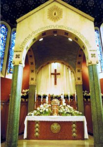
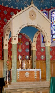
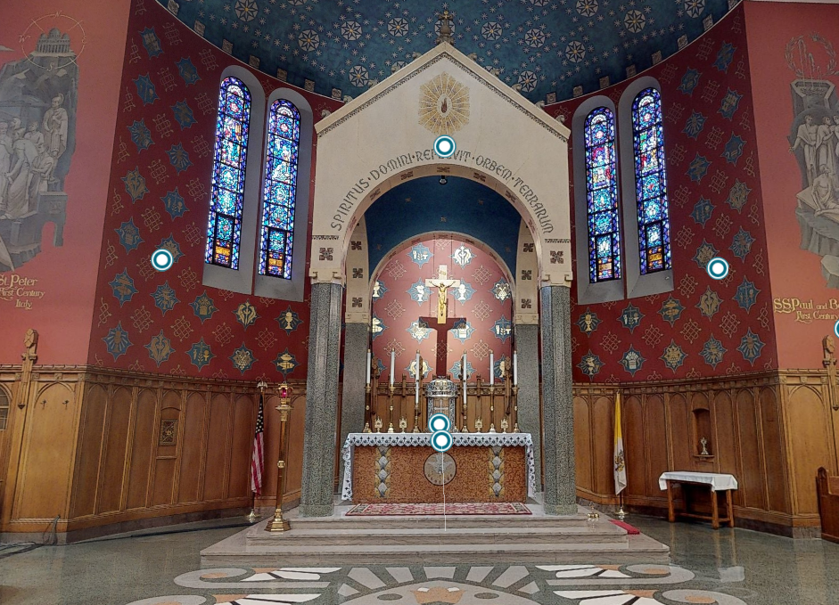
In my own parish church (take a virtual tour here), the floors are the color of green jasper and the clerestory walls are red, symbolizing the fiery Love of the Holy Spirit. On the clerestory are painted the saints, gathered like a cloud of witnesses (Heb 12:1; Rev. 7:9). In the apse is the throne-like altar with Jesus at the center (Rev 5:6); the seven lamp stands are surrounding Him with seven candles (Rev 4:5). In the stained glass of the transept are the 12 Apostles joined with the 12 patriarchs (symbolized by 12 wooden pillars). Together they form the 24 elders who surround the throne in Heaven (Rev 4:4). Above the high altar, in the clerestory windows, are the four living creatures also said to surround the throne (Rev 4:6-7). Additionally, on the floor of the sanctuary (see photo above) is a symbolic representation of the of the exterior of the ancient Jewish Temple. There is the flaming altar and, on either side, the eight tables where the animals were sacrificed. (I have written about these in more detail here: On The Biblical Roots of Church Design).

Sadly, in churches built after the 1950s, these biblical roots were often cast aside in favor of a “meeting house” design. No longer was the thinking that our churches should reflect heavenly realities, teach the faith, and follow biblical plans. Rather, it was that the church simply provided a space for people to meet and conduct various liturgies.

In some cases, the liturgical space came to be considered fungible in that it could be reconfigured to suit various needs: Mass today, concert tomorrow, spaghetti dinner next Wednesday. This idea began to appear as early as the 1950s. Pews were often replaced by chairs, which could easily be moved to suit various functions. Even in parishes that did not go so far as to allow spaghetti dinners in the nave (mine did in the 1970s), the notion of the church as essentially a meeting space still prevailed.

Thus, churches began to look less like churches and more like meeting halls. The bare essentials such as an altar, pews or chairs, a pulpit, and very minimal statuary were still there, but the main point was simply to provide a place for people to come together. There was very little sense that the structure itself was to reflect Heaven or even remind us of it.

That is beginning to change as newer architects are returning more and more to sacred and biblical principles in church design. Further, many Catholics are becoming more educated on the function of church art to impart meaning rather than just to look pretty. They are coming to understand the rich symbolism of the art and architecture, which reveal the faith and express heavenly realities.

Take stained glass, for instance. Stained glass art is more than just pretty colors, pictures, and symbols. Stained glass was used for centuries to teach the faith through pictures and symbols. Until about 200 years ago, most people—even among the upper classes—could not read well if at all. How does the Church teach the faith in such a setting? Through preaching, art, passion plays, statues, and stained glass.

Stained glass in churches depicted biblical stories, saints, sacraments, and glimpses of Heaven. Over the centuries a rich shorthand of symbols also developed: crossed keys = St. Peter, a sword = St. Paul, a large boat = the Church, a shell = baptism, and so forth. Thus, the Church taught the faith through the exquisite art of stained glass.

Stained glass also served another purpose: to act as an image of the foundational walls of Heaven. Recall that traditional church architecture saw the church as an image of Heaven. Hence a church’s design was based on the descriptions of Heaven found in the Scriptures. In the Book of Revelation, Heaven is described as having high walls with rows of jewels embedded in their foundations:

One of the seven angels … showed me the Holy City, Jerusalem, coming down out of heaven from God. It shone with the glory of God, and its brilliance was like that of a very precious jewel, like a jasper, clear as crystal. It had a great, high wall with twelve gates … The foundations of the city walls were decorated with every kind of precious stone. The first foundation was jasper, the second sapphire, the third chalcedony, the fourth emerald, the fifth sardonyx, the sixth carnelian, the seventh chrysolite, the eighth beryl, the ninth topaz, the tenth chrysoprase, the eleventh jacinth, and the twelfth amethyst ... (Revelation 21:varia).

Thus, because Heaven had great, high walls, older churches almost always had a lot of verticality. The lower foundational walls gave way to the higher clerestory and above the clerestory the vaults of the ceiling rose even higher. In the lower sections of the walls, extending even as high as the clerestory, the jewel-like stained glass recalled the precious gemstones described in the lower walls of Heaven.

Yes, it is amazing! I stand in my church and hear its message: you are in Heaven when you enter here and celebrate the sacred mysteries. Sursum corda! (Hearts aloft!)

Here is a video I put together on stained glass. Enjoy these jewels of light that recall the lower walls of Heaven as you listen to the choir sing “Christe Lux mundi” (O Christ, you are the Light of the world).

Cross-posted at the Catholic Standard: Does Your Parish Church Remind You Of Heaven? It Should!

What Our Church Buildings Say About Us

The week in the Office of Readings from the Liturgy of the Hours we are reading from the books of Haggai and Zechariah. Both these prophets wrote at the time of the return of the Jews from the Babylonian exile, which had begun in 587 B.C. The Jewish people were permitted to return to the Promised Land beginning in about 538 B.C. Haggai wrote his book in the summer of 520 B.C. and in it he scolds the people for concentrating on their “paneled houses” while the Temple is in a ruinous state. He ties their weak piety to the failure of crops, their inability to enjoy what they have, and other calamities.

Zechariah, who wrote in the autumn of 520 B.C., also expresses concern for the poor state of the Temple and ties its rebuilding to future blessings, including the coming of the Messiah. Later in the week, we will examine Zechariah’s writing.

In today’s post we look at a passage from the Book of Haggai and ponder what it means for us:

This is what the LORD of Hosts says: “These people say, ‘The time has not yet come to rebuild the house of the LORD.’” Then the word of the LORD came through Haggai the prophet, saying: “Is it a time for you yourselves to live in your paneled houses, while this house lies in ruins?” Now this is what the LORD of Hosts says: “Think carefully about your ways. You have planted much but harvested little. You eat but never have enough. You drink but never have your fill. You put on clothes but never get warm. You earn wages to put into a bag pierced through.” You expected much, but behold, it amounted to little. And what you brought home, I blew away. Why? declares the LORD of Hosts. Because My house still lies in ruins, while each of you is busy with his own house (Haggai, 1:2ff).

God does not need a fancy temple, but we do. The building of beautiful churches says a lot about our priorities and where our heart lies. Churches express our love for God and our desire to honor and thank Him. They need not be extravagant, but they should be adorned with a beauty and form that stands out as sacred and memorable, as an expression that we love God and take Him seriously, that He is a priority in our lives. In the Middle Ages, the town church was usually centrally located and was the tallest and most prominent building. By the 16th century, palaces and government buildings began to take that place. Today, the skyscrapers of our cities are named for investment banks and insurance companies. Yes, our buildings say something about our priorities!

Churches are also meant to remind us of Heaven. Until recent decades, they were built along lines that spoke to the heavenly realities both Moses and John saw as they were shown the heavenly worship and vision. Churches have high jeweled (stained glass) walls because Heaven does. Churches have glorious throne-like altars with the tabernacle at the center amidst tall candles because in Heaven there is a throne-like altar with the Lamb upon it and Jesus stands among the lampstands. Paintings and statues of saints and angels, incense, priestly robes, standing/kneeling appropriately, and singing of hymns all remind us of the communion of saints and angels in the heavenly worship. All of this is revealed in the heavenly visions contained in the Bible. (I have written more on this topic here and here.)

Haggai’s opening vision also says a lot about our inability to enjoy even the good things we have without God at the center. We all have a God-sized hole in our heart and only He can ultimately fill it. Trying to get created things to fill that gap is both frustrating and futile. The good things we do have point to God, the giver, and should inspire in us a gratitude and longing for Him. If we remove or marginalize God, our disorder affections gnaw away at us; no matter how much we get we remain dissatisfied.

God says through Haggai that fixing the ruined Temple is the way to fix their hearts. It is less about the building than about hearts. It is interesting that some of the most glorious and beautiful churches in this country were built by poor immigrant communities. We now live in times of comparative affluence, especially in America, but although incomes and home sizes have grown our churches seem to be built on the cheap, lacking both the nobility and glory that belong to God and which poorer generations produced in the churches of their time.

The problem has both theological and liturgical roots. A flawed notion of the liturgy claimed that churches should look more like living rooms or dining rooms than Heaven. (N.B. Some more recently built churches are returning to more traditional forms, but the reform has been slow).

Another problem was/is the “poverty of Judas.” This is the idea that money spent on buildings would be better used by being given to the poor. There may be a little truth to that, but the poor also want and need beautiful churches that remind them of Heaven and give due honor to God. A church is a space of beauty that all can share.

Yet another reason is that we just don’t value or prioritize the Lord and the liturgy as highly anymore. If we give less to the church perhaps we can buy a nicer car, a boat, or a vacation home. How is that ephemeral stuff working out for us? Are we happier? Haggai says no: You eat but never have enough. You drink but never have your fill. Exactly! All our blessing point to God and should instill gratitude and a longing for the true completion of an eternal relationship with Him.

Enough said for now. The point is not so much a building itself but what the building says about our hearts. God says today through Haggai, in effect, “Your paneled houses and the ruined Temple are a testimony to the condition of your hearts and your flawed priorities.”

Indeed, God should get the first fruits of our harvest, our best and highest effort. This is not because he needs them but because we do.

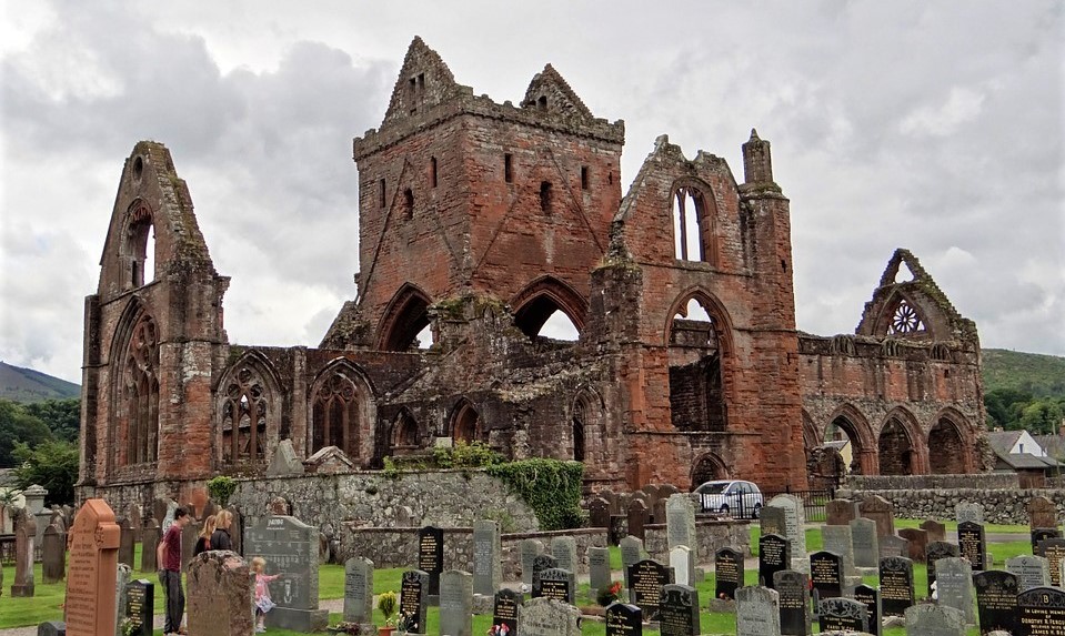
Regrettable Ruins: A Lament for a Lost Church Building

Many years ago, I saw the movie True Confessions  (1981), which was about an ambitious priest who discovered the truer meaning of the priesthood. Although the film was seedy in places, the outcome for the main character, Monsignor Spellacy, was salutary.

Robert DeNiro (who was more discreet and refined in those days) starred as Msgr. Spellacy. It was well acted, but it was the liturgical scenes that were especially noteworthy: they were beautiful, meticulous, and accurate. The movie was set in the 1940s and so the older Latin Mass was depicted in all its solemn, high glory (see the movie clip at the end of the post).

The church itself was gorgeous as well. Over the years I could never identify the church, despite asking many people. No one seemed to know. The movie credits made no mention of the parish where the Mass scenes were filmed. Even people I knew from the Los Angeles area (where the move was filmed) did not recognize the church. This was well before the Internet was in common use, so there was not the ability to pose a question far and wide. Until a few months ago, there just seemed to be no information available.

Mystery Solved – I finally stumbled upon the answer, completely by accident, about a month ago when I read about a fire that had destroyed St. Joseph Church in downtown Los Angeles in 1983.

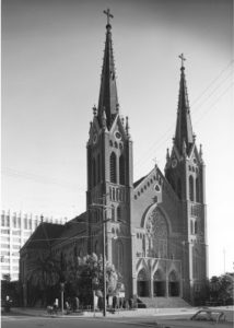
The article mentioned that St. Joseph had been seen in several TV shows and movies, including True Confessions. The cause was said to have been an electrical fire. The roof collapsed, and only the towers and some of the brick walls remained. What a loss! A smaller, modern church was subsequently built on the site to replace the older one.

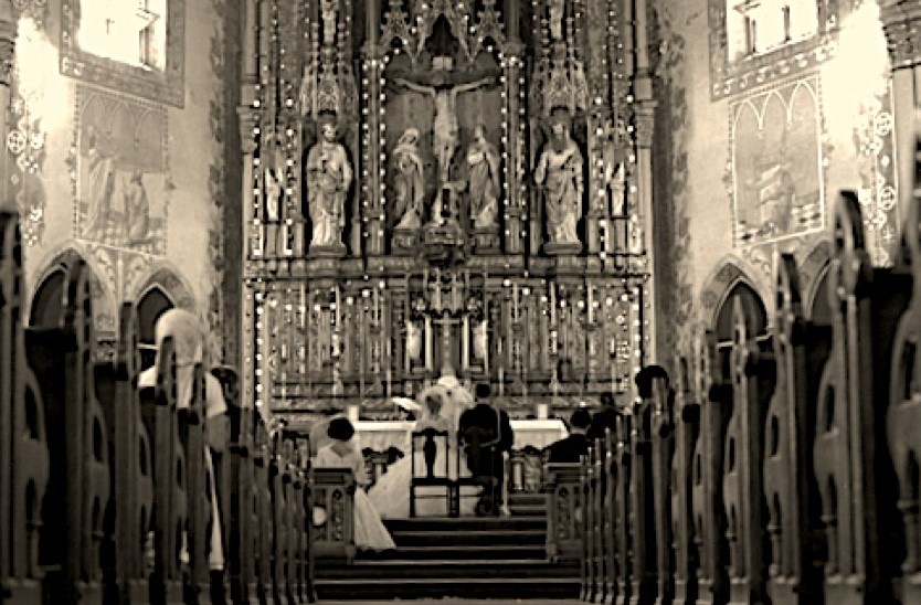
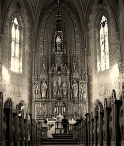
The exterior of the old St. Joseph Church is seen above. It was a truly magnificent German Gothic structure. Its interior is seen in the photo on the left, from 1960.

The following description of its beautiful interior was made upon its opening in 1903:

In the vast interiors of the great church … one may discover a wondrous work of gilt, and the deep tones of reds, greens, blues and yellows assembled with an artist’s touch into a magnificent whole.

This extensive fresco work [is] said to be the finest on the Coast. … For almost three months these men have toiled on the extensive work at St. Joseph’s sometimes far into the night…. … [I]t is said there will be no finer church edifice on the Pacific Coast. The whole building is to cost $100,000, and aside from this the furnishings make no small item.

Seven beautiful altars will be placed in the new building. These have been made in Munich. They are of white walnut and finished in white and gold. The main altar, of pure Gothic design, is forty-seven feet high, and the side altars are thirty and twenty-eight feet high.

The communion rail is also to be of polished walnut, with marble top; and the pews will be of white oak.

Most of the large windows are memorials, and they are to be of the richest colors in cathedral glass. These alone will cost about $6000. The Stations of the Cross are in bas-relief and set in alcoves in the walls. These are also products of Munich artists.

The main body of the church is 150 x 66 feet, and the transept is ninety-six feet wide. Back of this are the sacristy and rooms for altar boys, etc. The building has a large basement, fitted up for a hall, Sunday-school rooms, etc. Attached to the church on the east is the house of the Franciscan Fathers, which they now occupy.

All of this succumbed to the fire of Sunday morning, September 4, 1983; it was indeed a tragic loss. The current structure, though not ugly, is unremarkable. I have included additional pictures of the old and new churches here: The Church Where True Confessions Was Filmed.

I have written before about the sad fate of St. Vibiana, the former cathedral Church of Los Angeles (My Father’s House Has Become a Marketplace). I do not suppose that we can save all our beautiful structures, especially given the decline in the practice of the faith among Catholics, and although the damage to souls from this decline is far worse, the loss of these beautiful works that faith once produced is still lamentable. Accidents such as fire will cause losses as well, but they are still losses.

Below is some footage from the movie True Confessions, showing St. Joseph Church less than two years before its total destruction by fire.

On the Biblical Roots and Requirements of Church Design

092313In yesterday’s readings at Mass we read about how Moses laid out the “tent of meeting” exactly according to the pattern God gave him up on the mountain. A millennium later John described a similar scene of the sanctuary in Heaven.

Few Catholics today realize that God actually did indicate a good deal about how He expects our churches to be designed. And while some degree of variation is allowed and has existed, most modern churches have significantly departed from the instructions God gave. We do well to ponder church architecture not merely as an aesthetic question, but also as a question of fidelity to what God expects.

For the Church, the Scriptures are more than just ink spots on a page. The Scriptures are manifest in proclaiming how we live, how we are organized hierarchically, our sacraments, our liturgy, and even the design of our buildings.

Long before most people could read, the Church was preaching the Gospel. And to do so, she used the very structure of her buildings to preach. Many of our older buildings are sermons in stone and stained glass.

The Scriptures come alive in our art, statues, paintings, and in the majestic stained glass windows that soar along the walls of our churches like jewels of light. Even the height and shape of our older churches preach the Word. The height draws our eyes up to Heaven as if to say, Since you have been raised to new life with Christ, seek the things that are above, where Christ is seated at God’s right hand (Col 3:1). And the shape of most of our older churches is that of a cross, as if to say, May I never glory in anything save the Cross of my Lord Jesus Christ (Gal 6:14).

My own parish church is a sermon in stone, wood, and glass. It is designed around the Book of Revelation (Chapters 4 and 5), in which John is caught up into Heaven and describes it in detail. The fundamental design of the sanctuary drawn from Revelation 4 and 5 includes the throne-like altar (Rev 4:2), seven tall candles around the throne (Rev 4:5), and the four living creatures in the clerestory windows above the altar (Rev 4:6-8). At the center of the altar is the tabernacle, wherein dwells the once-slain Lamb who lives forever, Jesus (Rev 5:6). Around the throne (altar) are seated the 24 elders (Rev. 4:4), symbolized by the 12 wooden pillars on the back sanctuary wall and the 12 stained glass windows of the Apostles in the transept. The multitude of angels surrounding the throne (Rev 5:11) are symbolized by the blue and gold diamonds on the apse wall.

I have assembled pictures of these details along with the texts from Revelation in the following PDF document: Holy Comforter Church in Washington D.C. and the Book of Revelation

In effect, the builders of my church (built in 1939) were saying, when you walk into this church, you have entered Heaven. Indeed, it is a replica of the heavenly vision of John. And when we celebrate the Liturgy it is more than just a replica, for we are taken up to Heaven in every Mass, where we join countless angels and saints around the heavenly altar. There, we worship God with them. We don’t have to wait for some rapture; we go there in every Mass.

But there is more! For what John saw in Heaven is none other than what God prescribed to Moses. God told Moses quite explicitly how to construct the ancient sanctuary, the tent of meeting in the desert. The layout, materials, and elements were all carefully described.

And, having given these details, God said, Now have them make a sanctuary for me, and I will dwell among them. Make this tabernacle and all its furnishings exactly like the pattern I will show you (Exodus 25:8-9). And God later said, See that you make them according to the pattern shown you on the mountain (Ex 25:40). And God repeated, Set up the tabernacle according to the plan shown you on the mountain (Ex 26:40).

The Book of Hebrews explained why God insisted that the pattern be followed so exactly: They serve at a sanctuary that is a copy and shadow of what is in heaven (Heb 8:5). In other words, the Ancient Temple was meant to be a replica, or pattern of the heavenly sanctuary.

Most older Catholic churches maintain the basic pattern of what Moses was shown. This diagram compares the layout of the sanctuary in my parish church, Holy Comforter St. Cyprian (HCSC), with the layout of the temple:

092313-A

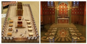
In the photo just below, you can see the remarkable similarity more visually. The pattern is even etched on the floor of my church, echoing a detail about the layout of the temple that Ezekiel described:

So there were four tables on one side of the gateway [of the sanctuary] and four on the other—eight tables in all—on which the sacrifices were slaughtered (Ez 40:41).

On the left below is a depiction of the setup of the tent of meeting as it was when the people were still in the desert. Next to it is a photo of my parish church sanctuary. You can see the remarkable similarity.

092313-B

Note the way the scrollwork on the floor of my parish matches the four tables on either side in the sanctuary where the animals were slaughtered. The fiery square and horned altar in the diagram of the temple are represented by the horned square on the floor of my church. In the diagram of the ancient sanctuary, the holy place, the holy of holies towers in the back, as do the high altar and tabernacle in my parish church.

Simply put, the builders of my parish church remarkably depicted the ancient temple as well as the vision of Heaven from the Book of Revelation. This is what church buildings should do: exemplify the heavenly sanctuary, the plan for which God Himself gave. Sadly, modern architecture has departed from that plan significantly. But in recent years, there has been something of a return to that plan, a trend for which we can only be grateful.

The Catholic Church is surely a biblical Church. My very building shouts the Word! We Catholics preach the Word not only with ink and in speech, but also in stone, wood, glass, liturgy, and the arts—all to the glory of God.

Here is a video of some of the details of my parish.

How Traditional Catholic Architecture Better Fulfills the Plan of God

092313Catholics have often endured the charge that we are an unbiblical Church. Strange accusation, really, for the Church that collected the Scriptures, determined the canon of Scripture and preached it for 1,500 years before there ever was a Protestant denomination. The fact is we are quite biblical and often in ways that are stunningly powerful.

For the Church, the Scriptures are more than merely ink spots on a page. The Scriptures are manifest and proclaimed in how we live, how we are organized hierarchically, our sacraments, our liturgy and even in our buildings.

Long before most people could read, the Church was preaching the Gospel. And to do so, she used the very structure of her buildings to preach. Many of our older builds are a sermon in stone and stained glass.

The Scriptures come alive in our art, statues, paintings, and majestic stained glass windows that soar along the walls of our Churches like jewels of light. Even the height and shape of our older churches preach the word. The height draws our sights up to heaven as if to say, Since you have been raised to new life with Christ, seek the things that are above where Christ is seated at God’s right hand (Col 3:1). And the shape of most of our older churches is the shape of a cross. As if to say, May I never glory in anything, save the Cross of my Lord Jesus Christ (Gal 6:14).

My own Parish Church is a sermon in stone and wood and glass. It is designed around the Book of Revelation, Chapters 4 and 5 in which John is caught up into heaven and describes it in detail. The fundamental design of the sanctuary drawn from Revelation 4 and 5 includes the throne-like altar (Rev 4:2), seven tall candles around the throne (Rev 4:5), the four living creatures in the clerestory windows above the altar (Rev 4:6-8). At the center of the altar is the tabernacle wherein dwells the Lamb once slain who lives forever, Jesus (Rev 5:6). Around the throne (altar) are seated the twenty-four elders (Rev. 4:4) symbolized by the 12 wooden pillars on the back sanctuary wall and the 12 stained glass windows of the Apostles in the transept windows. The multitude of angels who surround the throne (Rev 5:11) are symbolized by the blue and gold diamonds on the apse wall.

I have assembled pictures of these details along with the scripture texts from Revelation in the following PDF document: Holy Comforter Church in Washington DC and the Book of Revelation

In effect the builders of my Church (built in 1939) were saying, when you walk into this church, you have entered heaven. Indeed, it is a replica of the heavenly vision of John. And when we celebrate the liturgy it is more than a replica for we are taken up to heaven in every Mass where we join countless angels and saints around the heavenly altar. There we worship God with them. We don’t have to wait for some rapture, we go there in every Mass.

But there is more! For what John saw in heaven is none other than what God had prescribed to Moses. Moses was told quite explicitly by God how to construct the ancient sanctuary, the tent of Meeting in the desert. The layout, materials and elements are all carefully described.

And, having given these details God says, Now have them make a sanctuary for me, and I will dwell among them. Make this tabernacle and all its furnishings exactly like the pattern I will show you. (Exodus 25:8-9) And again God later says, See that you make them according to the pattern shown you on the mountain (Ex 25:40). And yet again God repeats: “Set up the tabernacle according to the plan shown you on the mountain (Ex 26:40).

The Book of Hebrews, commenting on this pattern says why God insists on the following of the pattern so exactly: They serve at a sanctuary that is a copy and shadow of what is in heaven. (Heb 8:5). In other words, the Ancient Temple was a replica, or a pattern really of the heavenly sanctuary.

Most older Catholic Churches maintain the basic pattern of what Moses was shown. Note this diagram, comparing the layout of the sanctuary in my parish church, Holy Comforter St Cyprian (HCSC) with the layout temple:

092313-A

In the photo just below, you can see the remarkable similarity more visually. The pattern is even etched on the floor of my church which echoes a detail about the layout of the temple that Ezekiel described:

So there were four tables on one side of the gateway [of the sanctuary] and four on the other–eight tables in all–on which the sacrifices were slaughtered. (Ez 40:41)

Here below (on the left) is a depiction of the setup of the Tent of Meeting as it was when the people were still in the desert, next to a picture of my parish church sanctuary showing the remarkable similarity:

092313-B

Note the way the scroll work on the floor of my parish (right) matches the four tables on either side in the sanctuary where the animals were slaughtered. The fiery square and horned altar in the photo of the temple (left) is represented by the horned square on the floor of my church (right). In the photo on the left of the ancient sanctuary, the holy place, and the holy of holies towers in the back, as does the high altar and tabernacle in my parish church on the right.

Simply put, the builders of my parish church remarkably depict the ancient temple and also the vision of heaven in the book of Revelation. This is what Church building should do: exemplify the heavenly sanctuary, a plan which God himself gave. Sadly, modern architecture has departed from the plan significantly. But in recent years, there has been something of a return, a trend for which we can only be grateful.

The Catholic Church is surely a biblical Church. My very building shouts the Word! We Catholics preach the word not only with ink and speech, but also in stone, wood, glass, liturgy and the arts, all to the glory of God.

Here is a video of some of the details of my parish.